

Grano Ballarat.
From blank space to an Italian Social Club with soul.
Grano started with a brief about food. It ended as a story about belonging — about the particular warmth of a room where the music is right, the wine is poured generously, and strangers become regulars by the second visit.
A new Ballarat Italian venue needed more than a name, it needed a world.
"A place for big flavours, big personalities, and a sense of belonging."
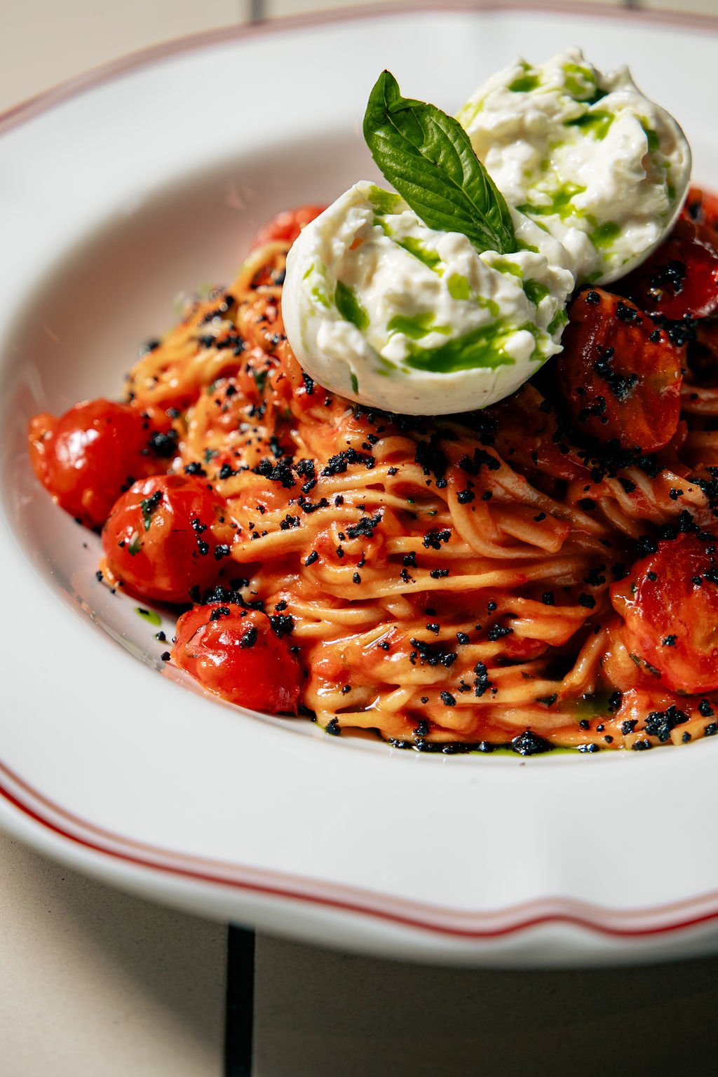
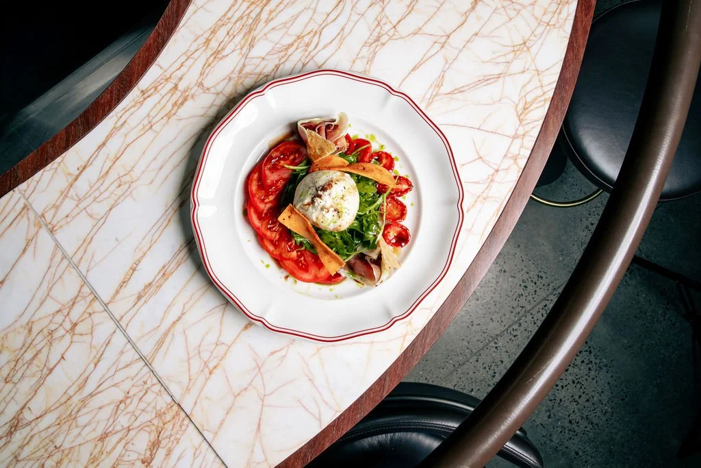
When the team behind Wildseed approached The Concept Distillery to build their new Italian concept at The Goods Shed in Ballarat, the brief was food-first: hand-stretched wood-fired pizza, hand-made pasta daily, specialty coffee from morning through night.
The space had strong bones - dark timber, leather, brass, warm light - and the appetite for something genuinely distinctive in Ballarat's dining scene was real.
But a menu alone doesn't make a destination. What the brief needed (what it was quietly asking for without quite saying it) was a world:
A point of view.
A reason for people to feel something when they walked in, not just when they ate.
The challenge wasn't designing a restaurant. It was building an identity so coherent, so felt, that every detail - the name on the sign, the words on the menu, the colour on the wall, the song on the speakers - pointed to the same emotional truth.
The concept:
Three directions.
One clear answer.
Before a single colour was chosen or a name was written, we did the strategic work. Three distinct concept directions were developed for the venue - each with its own emotional territory, cultural reference point, positioning logic and creative range. Each was tested against the space, the market, the operator's vision and the Ballarat dining landscape.
The chosen direction was the Italian Social Club. Inspired by the circoli -the communal gathering spaces of 1950s and 60s Italian immigrant culture, where people came not just to eat but to argue, celebrate,, pour wine too late into the evening and feel entirely at home - this concept offered something the others couldn't: narrative richness, emotional depth and an almost unlimited creative territory across every touchpoint of the guest experience.
The feasibility case was straightforward. Ballarat's dining scene had warmth and quality, but lacked venues with genuine cultural personality and theatrical energy.
The social club concept filled that gap without requiring the capital investment of a full-theatre kitchen build. The mid-century reference meant the aesthetic direction was distinctive without being polarising. And the food proposition - pizza, pasta, coffee - was both commercially proven and conceptually flexible enough to carry the brand.
The Italian Social Club won. Not because it was the safest choice, but because it was the richest one, and the team behind Wildseed had the confidence and the taste to back it fully.
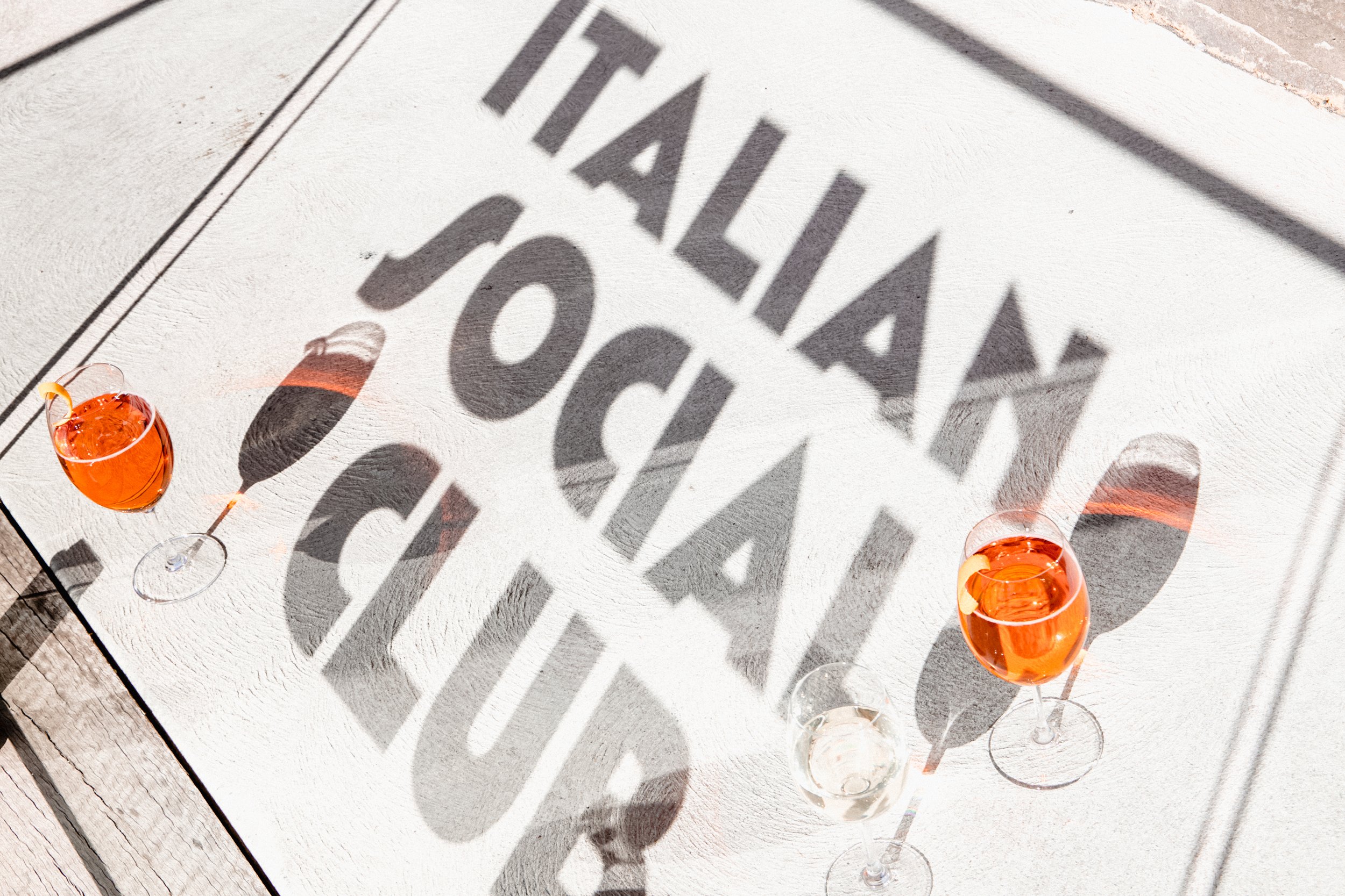
The name. Grain.
"The best names don't describe. They evoke."
Over twenty names were explored across the three concept directions. The naming criteria were consistent: short, immediately memorable, conceptually anchored, free of forced Italian clichés, equally strong on a sign, a social post and a reservation confirmation. The wrong name for a venue like this would be cheerful and obvious. A name like La Dolce Vita or Il Forno, technically accurate, entirely forgettable.
Grano is the Italian word for grain. It quietly references the hand-stretched dough at the heart of the menu, the milling heritage woven through Italian food culture, and the agrarian soul of a concept rooted in provenance and craft. One syllable. Clean, confident, slightly unexpected. The kind of name that earns its place without explaining itself.
The identity.
Mid-century Italy, translated.
For the visual direction, we looked to the golden era of Italian automotive and industrial design - Alfa Romeo, Lancia, Fiat, Olivetti. The language of mid-century Italy: geometric precision, confident typography, a sense of occasion worn without effort. . A design sensibility that had earned its authority.
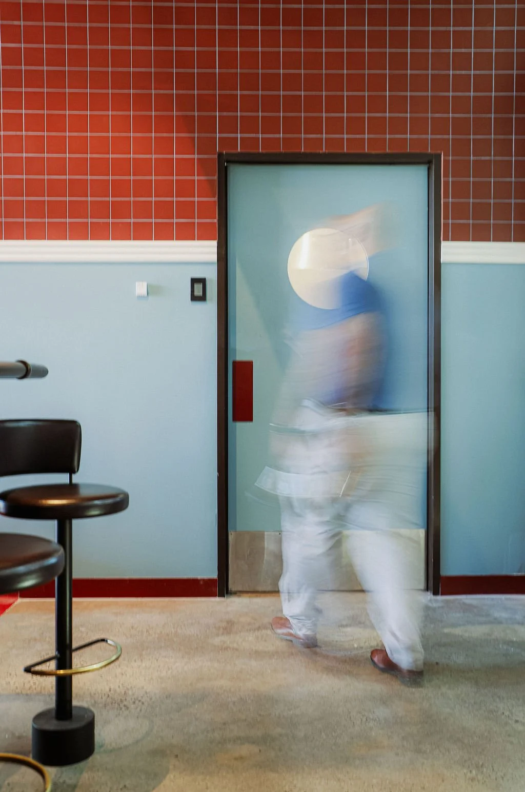
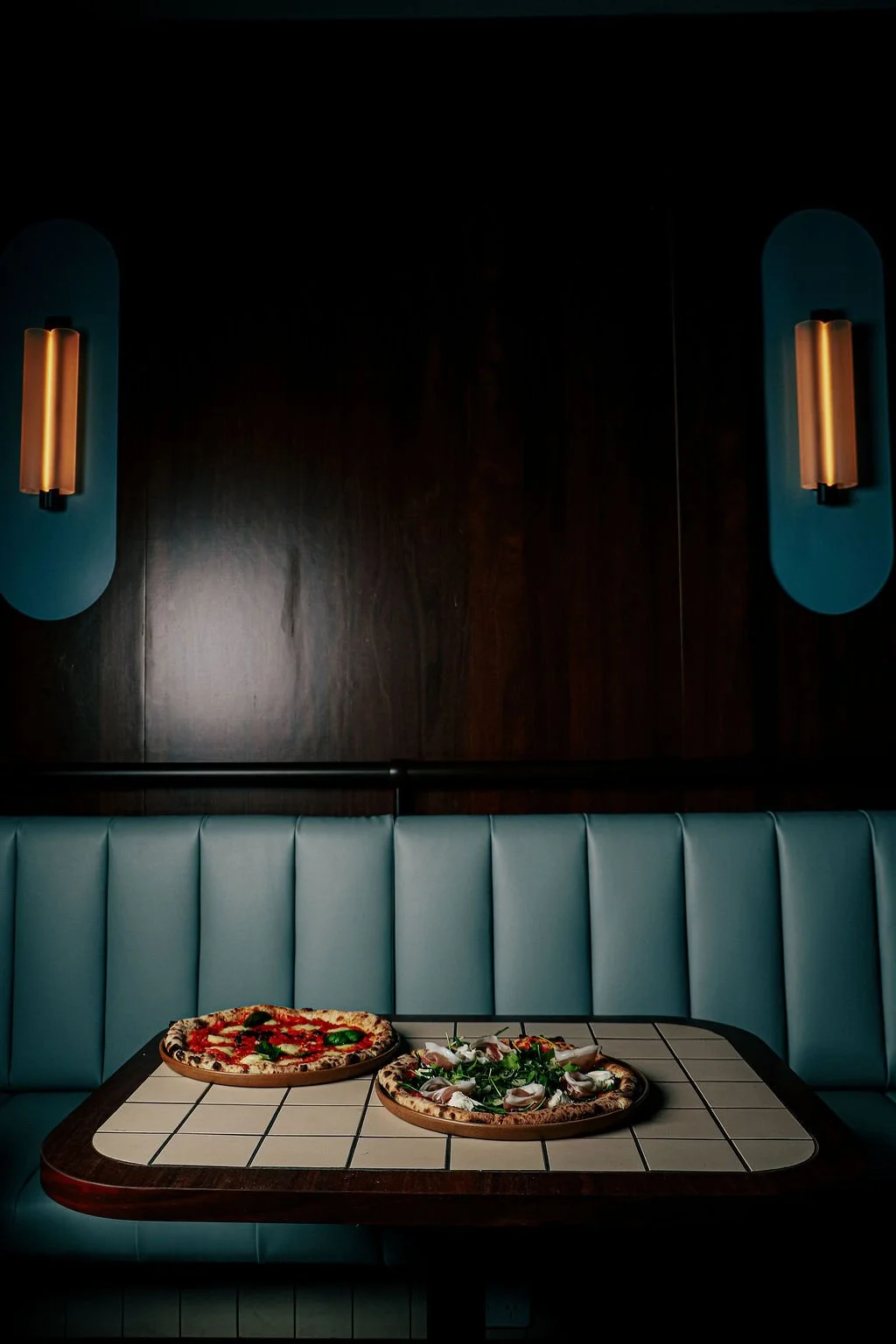
The space itself confirmed the direction. Dark timber, leather seating, brass hardware, geometric floor tiles - the bones of the room were already speaking mid-century.
The brand's job was to answer back in the same language, making the identity and the built environment feel continuous rather than applied on top of each other.
The result is a brand that feels both elevated and warm.
Detailed - there is real craft in the typographic choices and identity creation. Detailed enough to reward attention. Warm enough to never feel intimidating.
The Colour.
Not what you expect.
Exactly what you need.
Colour selection for Grano was one of the most deliberate decisions in the project, and one of the most important. A lesser approach would have reached for safe Italian red and white. We went somewhere more considered.
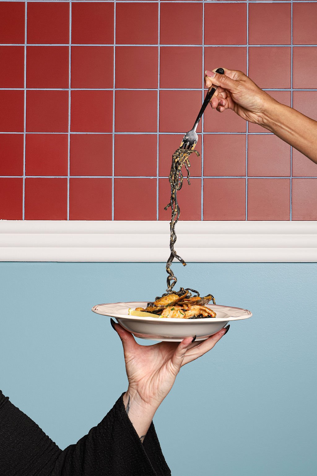
The palette anchors in a burgundy - a colour we inherited (and loved) in the existing interiors. It felt authoritative and rich, and with the addition of a light blue, and cream, the palette plays between playfulness and sophistication. echoing the concept of casual fine-dining, and removing the formal feel of the old dining room.
One of the interior challenges was uniting the interior which is moody and cocoon-like, and the courtyard area. The decision to move towards the blue, helped create some cohesion between the two areas.
The Playfulness.
Because a social club should feel like one.
In the menu language, personality emerged through dish naming, section headers and the small moments of wit in descriptors - dishes given character-led names, sections titled in Italian with enough warmth that even non-speakers felt welcomed rather than excluded. The tone: like a knowledgeable friend recommending their favourite, not a waiter performing professionalism.
One of the risks with a mid-century reference and a detailed visual identity is that it all becomes a little too considered. Too polished. Too earnest. The Italian Social Club concept demanded the opposite - it needed room to breathe, to be irreverent, to remind guests that this was a place where people came to enjoy themselves, not to perform appreciation.
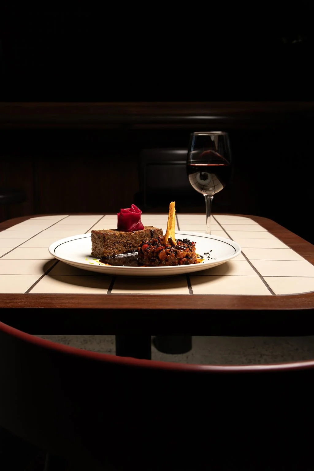
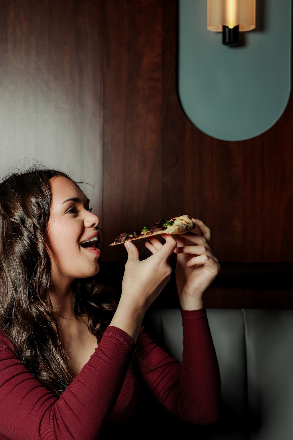
The playfulness was injected at every layer. The photography direction led the charge - warm, candid, colour-forward and people-first. Not styled plates under studio lighting, but hands reaching across tables, wine glasses mid-pour, groups in full conversation. The kind of photography that makes you feel something is happening and you want to be part of it.
The music concept was equally deliberate. Italian disco — the exuberant, slightly ridiculous, entirely irresistible genre of 1970s and 80s Italian pop — became the sonic identity of the space. Nostalgic and energised in equal measure, it reinforced the social club positioning through the ears as effectively as the brand did through the eyes.

"Elevated enough to feel like an occasion.
Playful enough to feel like a night out."
The menu & signage.
Every word, every surface, considered.
Menu consultancy for Grano spanned the full language strategy — not just what dishes were called, but how they were sequenced, described and positioned to build the Italian Social Kitchen world at the table. The wrong approach would have been technically accurate and entirely inert. The right one — which is what we built — makes the menu itself part of the experience.
Section headers in Italian. Descriptions in English. Signature items given names with stories behind them, character-led and specific enough to invite conversation. The language balanced warmth and wit: familiar enough to invite, distinctive enough to intrigue.
The full signage suite - exterior identity, interior wayfinding, menu boards and branded collateral - was designed and produced to maintain absolute typographic and tonal consistency across every physical surface. Signage is where brand identity either holds or falls apart in a live venue. At Grano, it holds.
The strategy.
Build the audience before you build the opening.
A venue launch is not a single event. It is a sequence of carefully placed moments, each designed to move a specific audience from unaware to curious to wanting to already feeling like a regular — before the doors have opened once.
The Grano launch strategy was built across four phases, coordinated simultaneously across Grano, its sister venues Wildseed and Lantern, radio channels across Ballarat and a targeted Meta advertising campaign. Every phase had a specific emotional job to do.
Build curiosity before revealing anything.
Teaser content focused on mood, texture and process - hands stretching dough, olives in brine, the glow of a wood-fired oven — not finished dishes. Waitlist capture via email and SMS. In-venue table inserts at Wildseed introduced Grano to an existing warm audience. Radio teaser across Ballarat referenced The Goods Shed as a destination. The goal: a growing list of people asking staff about Grano before it had said anything about itself.
PHASE 1
WEEKS −4 to −3
AWARENESS
Shift from mystery to appetite.
Product-led content revealing the handmade pasta, the wood-fired pizza, the specialty coffee program. Bookings opened with an exclusive early-access window for the waitlist. An influencer and media preview dinner was hosted, seeding early content and reviews across Ballarat's food community. The "Dine at Lantern, be first at Grano" competition activated demand across both venues simultaneously.
PHASE 2
WEEKS −2 to −1
DESIRE
PHASE 3
LAUNCH WEEK
CONVERSION
Fill seats and form first impressions simultaneously.
Aperitivo on arrival for every table in opening week — creating an immediate impression of generosity and setting the social club tone from the first moment guests were seated. Daily content showing a full venue, food in action, people enjoying the space. Launch email and SMS to the full waitlist. "Now open" messaging coordinated across all three venues and all media channels in Ballarat.
PHASE 4
WEEKS 2-6+
CONVERSION
Build repeat behaviour and destination status.
Ongoing social media content built around ordering moments, group dining occasions and the day-to-night transition. Monthly SMS for weekend booking prompts. Google Business Profile populated with purpose-shot content. Staff briefed on review prompting. The measure of success: consistent bookings without heavy ongoing promotional spend.
The outcome.
A brand concept that works as hard at a Tuesday lunch as it does at a Saturday night. A visual identity that holds across a menu, a neon sign, an Instagram story and a tote bag without losing an ounce of its character. A launch strategy that built a real audience before it needed one.
Grano isn't just a place to eat. It is a place with a point of view — and that point of view was built, deliberately and in full, before a single guest sat down.